Composing photographs while snorkeling - the basics
1a - Composition - the rule of thirds, horizons and active space
usually your main subject ie fish or coral, looks boring when dead centre of the picture
One of the most basic rules of composition - the rule of thirds
The idea is to divide your picture into thirds horizontally and vertically as shown on the right.
These grid lines are available to toggle on and off in many compact cameras and most software.
These grid lines are available to toggle on and off in many compact cameras and most software.

Your main object will look best on any of the intersections ie points 1, 2, 3 or 4.
The choice of intersection obviously is yours. Centre of the picture is thought to look boring.
The choice of intersection obviously is yours. Centre of the picture is thought to look boring.
The rule of thirds and horizons

Here the top of the coral is a third of the way down the photo, so acting as a sort of 'horizon'.
On land, photographing a landscape, we will often choose 1/3 sky or else, 1/3 land. Not 50 : 50.
Underwater we sometimes get a horizon of sand or rock bottom meeting an upper zone of water.
More often, we can create 'horizons' (vaguely horizontal separation zones). Such as when sand meets coral, rock meets coral or two different corals create a horizontal division.
This applies vertically as well ie underwater cliff profiles, sea walls and piers.

The coral is roughly central so, with less water at the top, it lacks any real horizon.
An easy one - active space

Active space applies on land and underwater.
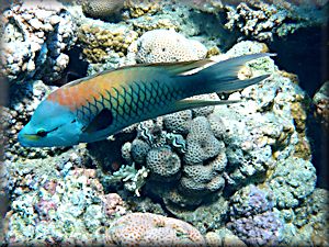
Anything which is moving looks better if it has space in front of it in which to move into.
It shouldn't look as if it is about to crash.
No active space in picture on the left and active space on the right.
Anything which is moving looks better if it has space in front of it in which to move into.
It shouldn't look as if it is about to crash.
No active space in picture on the left and active space on the right.

Compose as best you can underwater and don't shoot to 'tight'. Leave room for post-processing cropping.
We are holding our breathe so there is a limit to the precision of our composition underwater.
Nevertheless, 'horizons' are very easy to see once you know to look for them.
You wont get exactly one third, so err on slightly more than slightly less. You can cut some off (crop) later.
Nevertheless, 'horizons' are very easy to see once you know to look for them.
You wont get exactly one third, so err on slightly more than slightly less. You can cut some off (crop) later.
Active space is a doddle. Focus on the fish in the central focal spot then swing the camera a bit towards its
head before hitting the shoot button.
Don't shoot too 'tight' on the subject as in the photo on the right. Leave room to crop later.
That photo can't be composed as there is no space. It needs active space on the left.
Don't shoot too 'tight' on the subject as in the photo on the right. Leave room to crop later.
That photo can't be composed as there is no space. It needs active space on the left.
 t
t

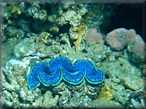
Not tight - on the left is extreme. The clam was shot from too far away with too much space around it, (so is not sharp when heavily cropped).
There's loads of space around the clam to cut one or other side, the top or bottom (or all of them as I did) ie to crop.
On the right, just one of many ways to make the clam look better positioned ie not boring dead centre. It's your choice where to position it.
There's loads of space around the clam to cut one or other side, the top or bottom (or all of them as I did) ie to crop.
On the right, just one of many ways to make the clam look better positioned ie not boring dead centre. It's your choice where to position it.


